|
EQUATIONS OF SCIENCE |
|
Bar graphs are display real numbers to compare different categories in a very visual manner. A bar graph is used to show relationships between groups. The two items being compared do not need to affect each other. It's a way to show big differences. A line graph depends on how the axis is defined in the x and y direction. The line graph uses the Cartesian coordinates system which helps predict results. A line graph is used to show continuing data and how one thing is affected by another. It's clear to interpret how things are going by the rises and falls a line graph shows. This kind of graph is needed to show the effect of an independent variable on a dependent variable.
|
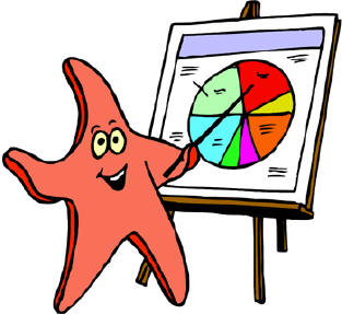 Pie graphs