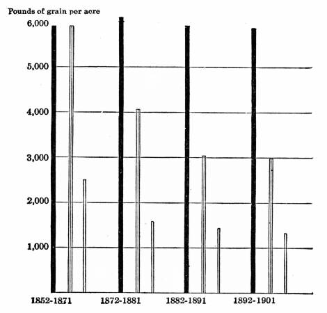
a. What type of
graph is shown below?
b. What does it show? c. Does it make sense? There is
pounds per acre and the years, but what do the three bars per year mean? What is
missing?
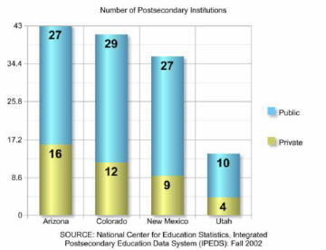
What elements do the graph below have that is
not present on the graph in question number 1?
How is it different in its style?
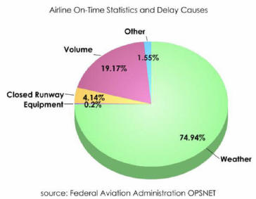
a. Calculate
the total percentage shown on this pie graph below. Write down the information
below. b. What causes the most
delay for airlines? c. What causes the
least amount of delay?
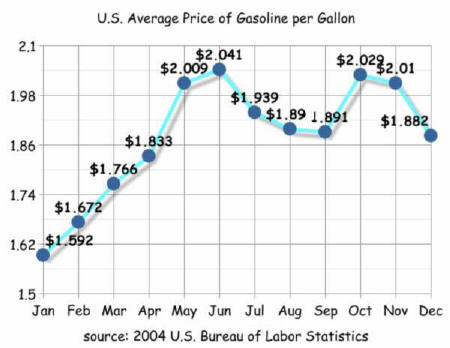
a. Look at
the line graph below.
Name the x axis. Name
the y axis. What
year Is this data for?
b. What is the highest
that gasoline was in 2004? When?